
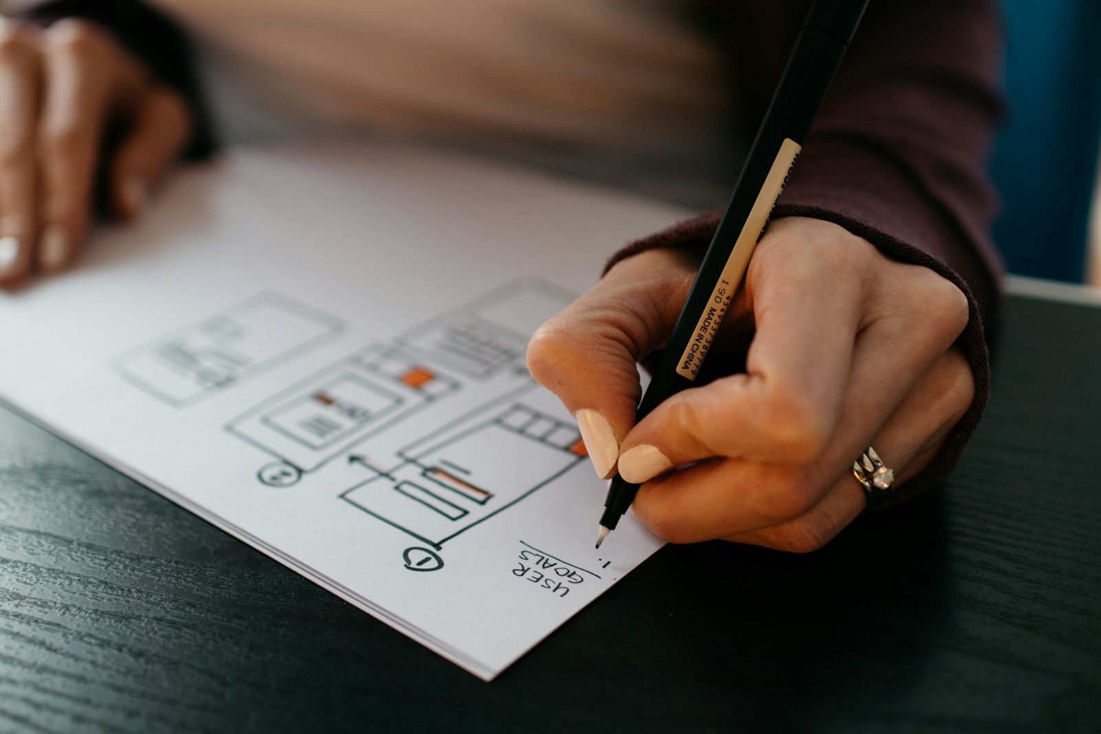
A UX audit before redesign is the cheapest insurance a product team can buy. I have watched teams spend months on a new look, then ship the same broken flows in a nicer coat of paint. Users noticed. The numbers did not move. An audit would have told them what was actually wrong before they decided what to change.
This post is part of my complete UX audit guide. Here I focus on one specific moment: the weeks before a redesign starts, when decisions are still cheap and nobody has fallen in love with a mockup yet. If you have a live product with real users, this is the window where an audit pays for itself.
Why a UX audit before redesign matters
A redesign is a bet. You are betting that the new version will work better than the old one. Without evidence, that bet rests on opinions. The CEO dislikes the colours. Sales wants a new dashboard. A designer saw a nice pattern on Dribbble. None of these are bad inputs, but none of them tell you where users are actually struggling.
A UX audit before redesign replaces some of that opinion with evidence. It shows you which screens cause drop off, which tasks take too long, which labels confuse people and which parts already work well. That last part is easy to forget. Every product has flows that users have learned and rely on. A redesign that breaks them creates new support tickets on day one.
There is also a simple cost argument. Changing a wireframe takes an hour. Changing a shipped feature takes a sprint, plus QA, plus release notes, plus the support load while users adjust. Finding problems early is always cheaper than finding them after launch.
What breaks when you redesign without evidence
These are the patterns I see most often when a team skips the audit and goes straight to visuals:
- Hidden features disappear. A filter or export option that looked like clutter turns out to be used daily by power users.
- Navigation moves for no reason. People who knew where things were now have to learn again, and they rarely thank you for it.
- The wrong problem gets solved. The team polishes the dashboard while the real friction sits in onboarding or billing.
- Accessibility gets worse. New colour palettes and custom components often fail contrast and keyboard checks that the old design passed.
- Success cannot be measured. With no baseline, nobody can say whether the new version is better.
A short UX audit before redesign catches most of these. It does not need to take months. For a typical SaaS product I usually plan two to three weeks, depending on the number of core flows and user roles.
How I run a UX audit before redesign
My process is simple and repeatable. It mixes data the team already has with a structured expert review. Here is the shape of it.
Figure 1 · UX audit before redesign: from evidence to scope
01 Goals
Why the redesign is happening and how success is measured
02 Evidence
Analytics, support tickets, recordings, reviews
03 Review
Core flows, heuristics, accessibility checks
04 Scope
Every screen tagged keep, fix or rebuild
1. Agree on the goals of the redesign
I start by asking why the redesign is happening. Is it conversion, retention, support load, a new market or a brand refresh? The answer decides where the audit looks first. A redesign for retention needs a deep look at onboarding and daily use. A redesign for a new market needs a look at language, layout direction and local expectations.
2. Collect the evidence that already exists
Most teams have more data than they think. I ask for analytics funnels, support ticket themes, session recordings, app store or review site feedback, and any past research. Ten minutes reading support tickets often reveals more than a week of guessing in a meeting room.
3. Map the core flows
I list the five to eight tasks that matter most to the business and the user. Sign up, first key action, invite a teammate, pay, export a report. Then I walk through each one on real accounts, on desktop and mobile, and note every point of hesitation.
4. Review against heuristics and accessibility
I check each flow against the Nielsen Norman Group’s 10 usability heuristics and run basic checks against WCAG 2.2: contrast, focus states, keyboard access, form labels and error messages. A lot of quick wins live here.
5. Score and group the issues
Every issue gets a severity score and a note about which flow it affects. I group related issues together, because ten small problems on the same screen usually point to one design decision that needs to change.
6. Write findings the team can act on
The report is short. Each finding has a screenshot, what is wrong, why it matters to the user and a suggested direction. No fifty page PDF that nobody reads after the first meeting. A good UX audit before redesign should fit in one working session with the team.
Keep, fix or rebuild: turning findings into scope
The most useful output of a UX audit before redesign is not the list of problems. It is the decision about what to do with each part of the product. I sort every screen and flow into three groups:
- Keep. It works. Users know it. Leave the structure alone and only update the visual layer.
- Fix. The structure is fine, but there are clear problems: unclear labels, missing feedback, weak error handling. Targeted changes solve them.
- Rebuild. The flow is fundamentally wrong for the task. This is where the real redesign effort should go.
In my experience the rebuild group is usually smaller than the team expects. That is good news. It means the redesign can focus its energy where it matters and avoid touching things that already work. It also gives engineering a much clearer estimate, because “redesign everything” is impossible to plan while “rebuild these three flows” is not.
Common mistakes with a UX audit before redesign
Even teams that do run an audit can lose most of its value. Watch for these:
- Auditing the new mockups instead of the live product. The point is to learn from real use, not from a Figma file.
- Only looking at the marketing site. For SaaS and web apps the real friction is usually inside the product.
- Treating the audit as a formality. If the redesign direction is already locked, the findings will be ignored.
- Skipping baseline metrics. Record task completion, drop off and support volume now, so you can compare after launch.
- Doing it alone. Bring a developer and a product manager into at least one review session. They notice different problems.
If your product is a complex web app with dashboards, tables and multi step forms, my usability audit walkthrough for web apps goes deeper into those patterns. And if you already know where people get stuck, the guide on how to fix user journey friction covers the next step.
When to run a UX audit before redesign
The best time is before any visual work starts and before a deadline is announced. In practice, I recommend running a UX audit before redesign planning begins in the roadmap, so the findings shape the budget and timeline. If design has already started, it is still worth doing. You will just have to be more honest about what to throw away.
A UX audit before redesign also helps after launch. The findings become your test plan. When the new version ships, you check the same flows against the same baseline and see what actually improved. Without that, every redesign review turns into a debate about taste.
UX audit before redesign checklist
Use this as a starting point and adjust it to your product.
- Redesign goals written down and agreed by product, design and engineering
- Analytics funnels exported for the top five to eight core flows
- Last three months of support tickets tagged by theme
- Each core flow walked through on desktop and mobile, with notes and screenshots
- Heuristic review completed for every core flow
- Contrast, keyboard and form label checks done against WCAG 2.2
- Issues scored by severity and grouped by flow
- Every screen tagged as keep, fix or rebuild
- Baseline metrics recorded for comparison after launch
- Findings presented in a working session, not just sent as a file
The hardest part is often seeing your own product clearly. You built it, you know where everything is, and the rough edges stop being visible. An outside view on your product helps. If you are planning a redesign and want a UX audit before redesign work begins, get in touch through chandrajith.in.
Frequently asked questions
How long does a UX audit before redesign take?
For most SaaS products and web apps, two to three weeks is enough. A small marketing site can take a few days. Large products with many user roles may need longer, or an audit split into phases.
Can our team run the audit ourselves?
Yes. Your team can follow the checklist above. The risk is familiarity: people who built the product often stop noticing its problems. An external reviewer brings fresh eyes and no attachment to past decisions.
Is a UX audit the same as usability testing?
No. An audit is mostly an expert review supported by existing data. Usability testing watches real users try real tasks. They work well together, and the audit often tells you what to test.
What if the audit shows we do not need a full redesign?
That happens more often than people expect, and it is a good result. You can fix the real problems faster and at lower cost, and save a larger redesign for when the evidence supports it.

2 Comments