
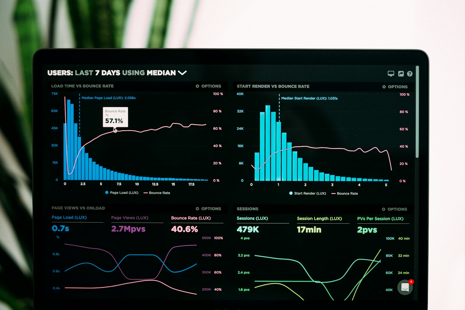
Most advice about user experience design is written for simple products: a signup flow, a landing page, a shopping cart. I spend most of my time on a different kind of product. Enterprise dashboards, government service portals, data platforms with dozens of roles and hundreds of screens. The principles still apply, but they bend in specific ways when the app is complex and the users are experts.
This post collects the seven principles I rely on most when I review or design complex apps. If you want a structured way to find the problems first, start with my UX audit guide. This post is about what good looks like once you know where the problems are.
Why user experience design is different for complex apps
A consumer app usually has one main job. A complex app has many jobs, many users and many states. A single screen in a data platform can show filters, a table, a chart, bulk actions and a status panel at the same time. The people using it often spend six or eight hours a day inside it.
That changes the goal. In a simple product, user experience design is often about reducing friction for a first visit. In a complex product, it is about reducing effort for the hundredth visit, without making the first visit impossible. You are designing for learning curves, not just first impressions.
It also changes the cost of mistakes. An unclear button on a marketing site costs a click. An unclear bulk action on an approvals screen can cost a day of rework for a whole team.
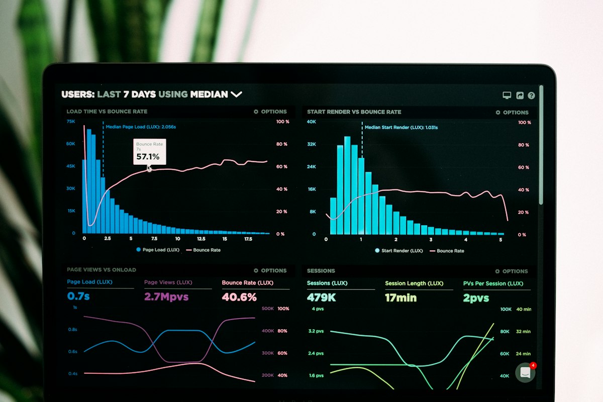
Seven user experience design principles for complex apps
Figure 1 · Seven principles at a glance
01 Progressive disclosure
Show what most people need. Reveal the rest on demand.
02 Summary before detail
Answer “is anything wrong?” before showing rows.
03 Consistent patterns
One way to filter, one way to confirm, everywhere.
04 Recoverable actions
Undo, drafts and soft delete over scary dialogs.
05 Clear system status
Say what is loading, saved, failed or stale.
06 Density for experts
Compact views and shortcuts for daily users.
07 Arabic and RTL first
Mirror layouts by design, not as a late patch.
1. Progressive disclosure
Complex apps fail when every option is visible at once. Progressive disclosure means you show the controls most people need, and you move advanced options one step away. Nielsen Norman Group has a clear write up on progressive disclosure that is worth reading in full.
A practical example: a report builder. Most users pick a date range, a department and a format. A few users need custom grouping, calculated fields and scheduled delivery. Put the first three on the main panel. Put the rest under an “Advanced options” section that remembers its open state for the people who use it daily.
The test I use: can a new user complete the most common task without opening anything? If not, too much is hidden. Can an expert reach every option in two clicks or less? If not, too much is buried.
2. Summary before detail
Most people open a dashboard with one question: is anything wrong? Answer that first. Put a short summary row at the top, such as counts of items pending, overdue and failed. Then let people drill into the detail.
I see many screens that open straight into a table of 500 rows. The user then has to scan, sort and filter to answer a question the system already knows. A summary layer costs very little to build and saves time on every visit. It also scales. A summary works the same whether there are 50 records or 5,000.
3. Consistent patterns across the product
In large products, inconsistency creeps in team by team. One module filters with a side panel, another with chips, a third with a modal. Each choice made sense locally. Together they make the product feel like five products.
Good user experience design in complex apps depends on a small set of repeated patterns: one filter pattern, one table pattern, one confirmation pattern, one empty state pattern. This is where a design system earns its keep. Consistency is also the fourth of the ten usability heuristics for a reason. Users should not have to wonder whether different words or layouts mean the same thing.
4. Recoverable actions
Confirmation dialogs are the default answer to risky actions. They do not work well. Expert users click through them without reading. A better approach is to make actions recoverable.
- Undo: show a short “Undo” option after archiving or moving items.
- Drafts: save long forms automatically so a session timeout does not erase work.
- Soft delete: move items to a recoverable state before removing them for good.
- Preview: for bulk changes, show what will change before applying it.
Keep real confirmation dialogs for actions that truly cannot be reversed, and write them so they name the exact consequence, such as “Delete 24 invoices permanently”.
5. Clear system status
Complex apps do a lot in the background: imports, syncs, approvals, scheduled jobs. When the interface does not explain what is happening, people refresh, retry and raise support tickets.
Show status in plain words. “Saving”, “Saved 2 minutes ago”, “Import failed on row 31”, “Data last updated at 09:00”. For long jobs, let people leave the screen and notify them when the job finishes. Stale data is a status too. If a chart shows yesterday’s numbers, say so on the chart.
6. Density that respects expert users
There is a common habit of adding white space everywhere because it looks modern. For a daily user who compares rows all day, too much white space means more scrolling and less context.
Respecting experts does not mean cramming. It means giving choices:
- A comfortable and a compact table density, remembered per user.
- Keyboard shortcuts for frequent actions, listed in a help panel.
- Saved views and saved filters, so people do not rebuild them every morning.
- Column control, so each role can show what matters to them.
This kind of user experience design work rarely needs a new visual language. It is mostly about listening to the people who use the product for hours.
7. Arabic and RTL as first class
In the UAE and the wider region, many products must work equally well in Arabic and English. Treating Arabic as a translation task at the end of the project creates broken layouts, clipped labels and charts that read in the wrong direction.
Plan for RTL from the start. Use logical CSS properties such as margin-inline-start instead of margin-left. Mirror navigation, progress indicators and directional icons, but do not mirror things like media playback controls, numbers or logos. Test with real Arabic content, which is often longer or shorter than the English and uses different line heights. The UAE Government Design System is a useful reference for how bilingual patterns can be standardised.
Applying user experience design principles without a redesign
None of these principles require starting over. Most of them can be added screen by screen. I wrote about this in more detail in how to improve UX without redesigning. If you are still deciding between incremental fixes and a full rebuild, my comparison of UX design vs a full redesign walks through the trade offs.
Figure 2 · Where to start
Quick wins
Status messages, undo, saved filters, clearer dialog copy.
Medium effort
Summary rows, density toggle, advanced option panels.
Structural
Unified patterns in a design system, full RTL support.
A sensible order is to start with the quick wins, because they build trust with users and stakeholders. Then take on medium effort work in the most used screens. Leave structural work for when you have evidence and a plan, ideally backed by a design system so the fixes stay fixed.
User experience design checklist for complex apps
Use this list when you review a screen. If you answer “no” to more than a few, that screen is a good candidate for your next round of work.
- Can a new user finish the most common task without opening advanced options?
- Can an expert reach any option in two clicks or less?
- Does the screen answer “is anything wrong?” before showing detail?
- Do filters, tables and confirmations work the same way as on other screens?
- Can the user undo or recover from the most common risky action?
- Does every background job show its status in plain words?
- Is it clear when data was last updated?
- Is there a compact view or saved view for daily users?
- Does the layout mirror correctly in Arabic, with real Arabic content?
- Does the screen meet WCAG contrast and keyboard requirements?
This checklist will not replace research with real users. It will help you spot the most common gaps in user experience design quickly, and give your team a shared language for what “better” means.
Need a second pair of eyes?
If you are working on a complex enterprise or government product and want an outside review of the user experience design, I am happy to help. You can get in touch through chandrajith.in.
Frequently asked questions
What is user experience design for complex apps?
It is the practice of designing products with many roles, screens and states, such as enterprise dashboards and government portals, so that both new and expert users can complete their work with less effort and fewer errors.
Which user experience design principle should I apply first?
Start with clear system status and recoverable actions. They are usually cheap to add, they reduce support requests, and users notice the difference quickly.
Is progressive disclosure bad for expert users?
Not if it is done well. Keep advanced options one step away, remember their open state, and add shortcuts. Experts lose very little time, and new users gain a lot of clarity.
How do I make a complex app work in Arabic and RTL?
Plan for it from the start. Use logical CSS properties, mirror directional elements, keep numbers and logos unmirrored, and test with real Arabic content instead of placeholder text.
