
This UX case study from Dubai walks through the redesign of piHappiness, a customer experience SaaS platform built in the UAE. The product collects customer satisfaction data through surveys and forms, then turns it into analytics based on NPS, CSAT and pulse metrics. My brief was to redesign the platform end to end: research, information architecture, UI and a design system that could carry the product forward.
UX case study Dubai: piHappiness
My role covered user research, prototyping, UI design, art direction, brand design, and building and maintaining the design system. The redesigned product is live today at pihappiness.com.
The challenge: a UAE SaaS product that outgrew its design
piHappiness had grown for years without UX involvement. The features worked, but the user journey had never been deliberately defined, so restructuring the platform took real effort. The application also needed to look professional and trustworthy. A tool that measures customer happiness has to inspire confidence itself, especially when it is deployed at reception desks, retail counters and service centres across the UAE and the wider Gulf, where first impressions decide whether a customer taps the kiosk at all.
That regional context shaped the work. Surveys here run in English and Arabic, reach customers over SMS, email, QR codes, web links and in-store kiosks, and serve industries from retail to government service centres. The redesign had to hold up across all of it.
The UX design process
We started with user research to understand pain points, analysed the findings and defined the core tasks of the product. I led the design team through the whole process, communicated milestones and presented work to get buy-in from executives and the sales team.
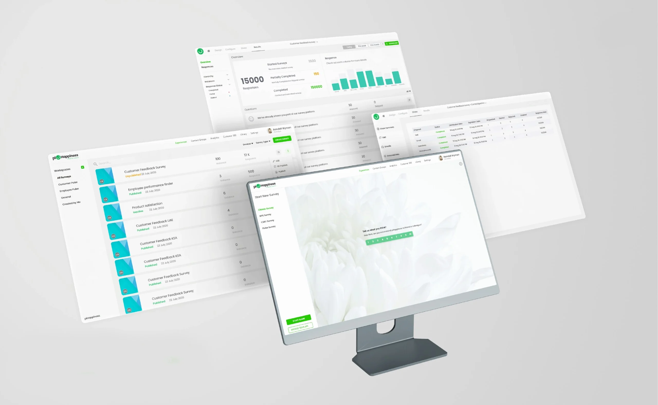
The redesign restructured the platform around those core tasks. Creating, publishing and analysing a survey now happens in one clear flow instead of scattered screens. Survey builders choose from NPS, CSAT, classic and pulse formats, distribute across every channel, and read the results in a single analytics view. Alongside the redesign I built a design system so new features stay consistent without constant design intervention, which also cut the back and forth between design and development.
My role
User research, prototyping, UI design, design system, art direction and brand design.
Product
SaaS web platform with survey kiosks, SMS, email and QR distribution, in English and Arabic.
The Results
“The redesign became the face of the product, the version every demo now leads with.”
A platform that finally looks as reliable as the data it collects
The redesigned platform shipped and is live at pihappiness.com. Built around the core tasks our research surfaced, creating, publishing and analysing a survey now happens in one clear flow instead of scattered screens, and NPS, CSAT and pulse responses from web, SMS, email, QR and kiosk all land in a single analytics view.
The design system I built and maintained keeps every new feature consistent and cut the back and forth between design and development. Together with the brand refresh, it gave a tool that measures customer happiness the professional, trustworthy face it needed, and won lasting buy-in from executives and the sales team.
Lessons from this UX case study Dubai teams can use
Design the core task first. Once creating, publishing and analysing a survey became one flow, every other screen had a clear place to sit.
A design system pays for itself in a growing product. New features now ship consistent without a designer reviewing every screen.
Trust is a visual feature. For a tool that sits on reception desks and kiosks across the UAE, looking reliable is part of being used.