What Is Usability?

What Is Usability
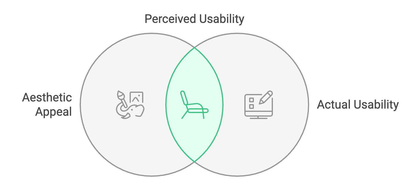
One of the most common myths in UX is that good usability is more pleasing to the eye. It is impossible for something to “look usable.” If someone says that about your design, ignore it. When users are surveyed about which design is “most usable,” their opinions are more associated with beauty than effectiveness. This suggests we cannot trust user opinions about how usable a design is.
Usability is measured by what people do:
- If more people buy something in an uglier design, it’s more usable.
- If people read more in an uglier design, it’s more usable.
- If more people register via the uglier design, it’s more usable.
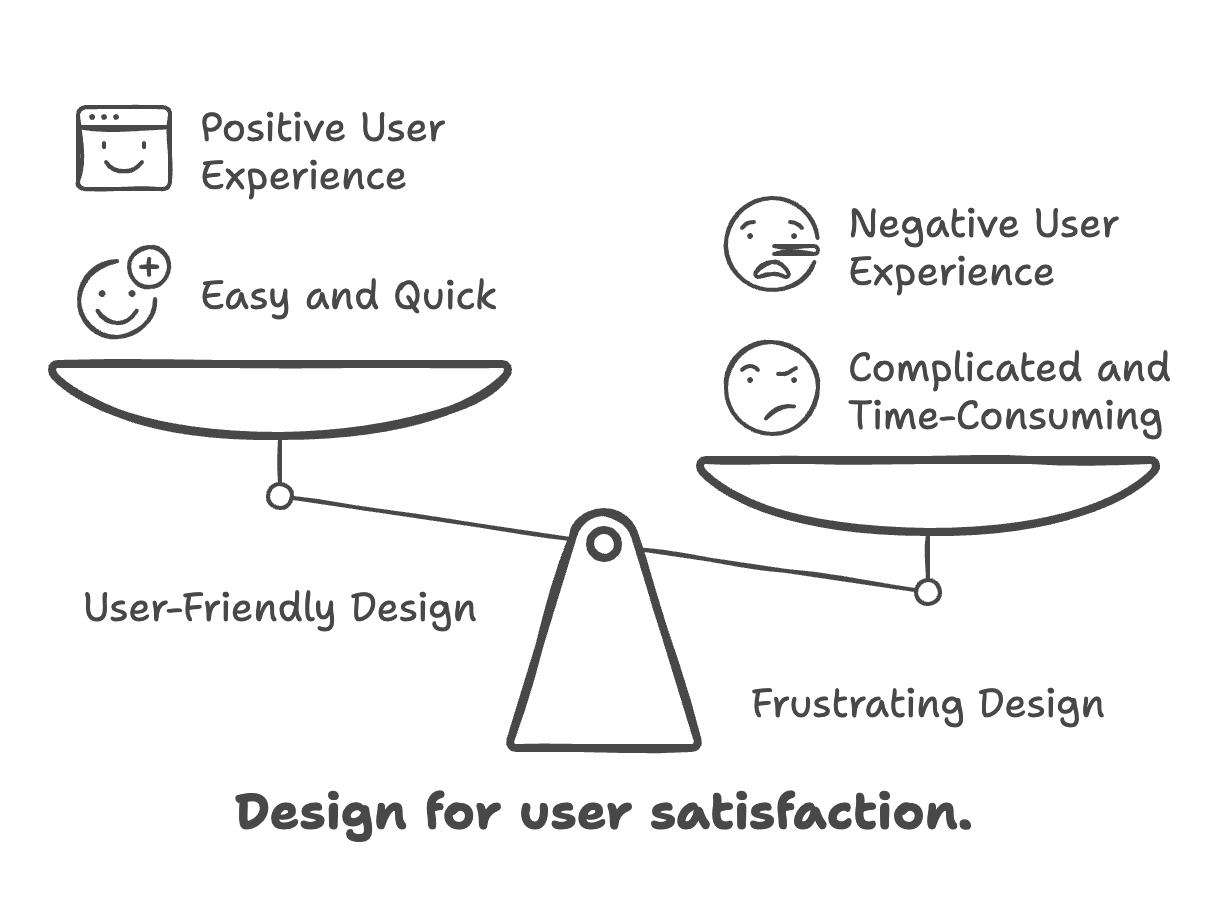
Sometimes, you’ll be forced to settle between beauty and usefulness. Always choose usability.
Usability = Cognitive Load
Cognitive load refers to the quantity of mental effort and processing power required to complete a task or learn new information.
For example:
- It takes less work to continue what you’re doing than to try to do something different.
- It takes less work to seek out something again than it did to seek out it the first time.
- It takes less work to read simple words than to read complicated words.
- It takes less work to agree than it does to complain.
Every detail in your design (and in your life) should reduce the quantity of cognitive load between the user (or yourself) and positive goals. Usability is every detail, every moment, whenever.
Simple, Easy, Fast, or Minimal
A word you might hear in UX is heuristics. A heuristic is an approach or technique for solving a problem. For example, let’s say you want to get more people to complete a process with many steps, such as checkout, registration, or getting through the body scanners at the airport (i.e., you want to increase conversion).
Simpler: Fewer Steps
As a UX designer, it’s only a matter of time before someone brings you a seven-page registration flow that must be simplified.
- Remove any questions that aren’t necessary, like confirming your email address.
- Detect information, just like Mastercard, rather than asking for it.
- Automatically format answers properly, like a telephone number, rather than requesting them in several chunks (or using errors).
The disadvantage of simplification is that it might collect less information or take longer to create. And if you refrain from confirming that email address, a typo can ruin the entire registration.
Easier: More Obvious Steps
It is nearly always possible to make a more prominent issue. Just pretend you’re designing for one of the guys from Duck Dynasty.
- Allow users to choose their country from a list rather than asking them to type it.
Browsing, Searching, or Discovery
Browsing
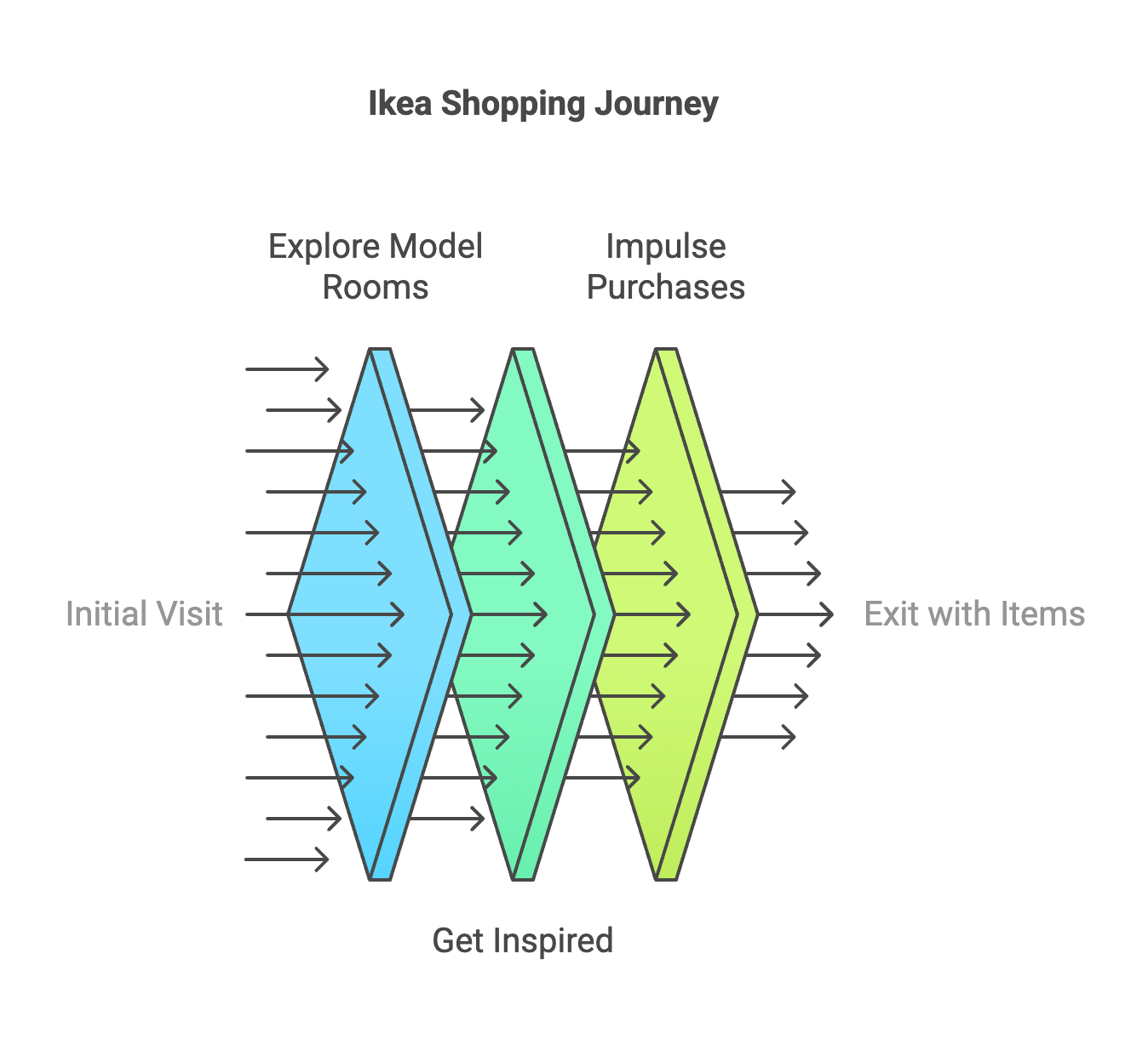
This is when you go to Ikea to look at model rooms just to get ideas—and you probably walk out with a bunch of random items anyway.
Searching
Searching begins when you go to Ikea looking for a new sofa that fits in your small apartment.
Discovery
This is when you find the sofa you’re looking for and also buy the clever little nested end-tables from the same showroom because they are so well designed.
Consistency and Expectations
Consistency is the concept of a design looking the same from page to page, device to device, or user to user. When a user logs in today, they expect the site or app to look the same as it did last time. This helps them find the menu, navigate familiar sections, and skip unnecessary content.
Patterns Require Consistency
The human brain is a pattern-recognition machine. It learns from past experiences and applies that knowledge to future interactions.
- The menu should be in the same place on every page.
- Colors should indicate warnings and importance consistently.
- Features should behave predictably across platforms.
However, consistency is a tool, not a rule. If something needs to be different for usability’s sake, don’t force consistency.
Anti-UX
There is a difference between bad UX design and a UX design that works against the user. The difference is psychology. Anti-UX prevents mistakes and bad decisions by using ordinary UX principles in the opposite way.
The Good, The Bad, and the Anti

Imagine you run a members-only website for clown car mechanics. It has great content but requires a subscription. If users want to cancel their accounts, the UX design of that process can take different approaches:
Good UX:
- The cancellation form is clear and straightforward.
- The “cancel my subscription” button is in a logical place.
- Users receive an email to verify cancellation.
Bad UX:
- The cancellation form is complex and confusing.
- The “cancel” button is hidden or tiny.
- Errors force users to restart the process multiple times.
In the real world, bad UX might reduce cancellations, which benefits the business but harms the user experience.
Accessibility
Accessibility is about designing for people with different abilities or limitations. It is not just about disabilities but about making designs usable for all users. Accessibility is a major consideration for public sites, government services, and platforms with diverse user bases like Facebook and news websites.
For beginners, the key takeaway is to be aware of accessibility needs and incorporate them into your design process whenever possible.

